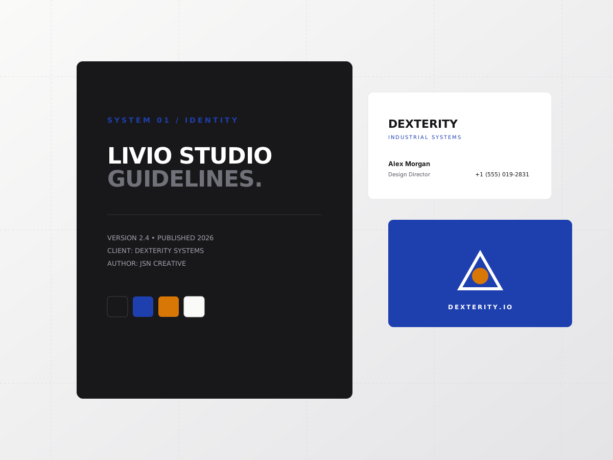
How Livio Designs built a cohesive visual architecture, geometric mark, and print collateral suite for an industrial innovation consultancy.
Dexterity came to Livio Designs with a fragmented visual presence. Their collateral was inconsistently rendered across digital slide decks, print business cards, and social media channels. They required a unified identity system that signaled technical competence, geometric precision, and modern authority.
Under JSN Creative direction, we established a strict grid-based mark derived from interconnected geometric nodes. We developed a high-contrast color palette anchored in deep cobalt and neutral canvas stone, paired with Plus Jakarta Sans for headers and Space Mono for technical callouts.